

Definition: Responsive means "reactive". A responsive web design therefore is a "reactive web design" - it describes the ability of a website to adapt to the selected device and thus present the content of a page equally (with the same usability and handiness) for all resolutions.
The development of online marketing as well as mobile technologies is racing. Not long ago it was quite normal to access a website only from the desktop (from home). But today more and more accesses are made via mobile devices. This requires a website to be responsive. That means that the content of the site must adapt to its environment (desktop, tablet, mobile).
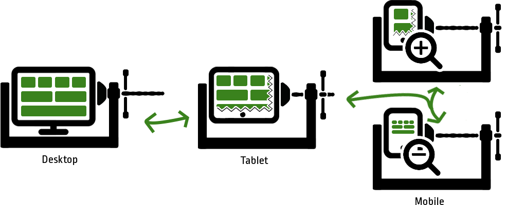
Even though you still have a lot of space on a monitor, it can become scarce on the smartphone. If you visit a page that is not optimized to act responsively, you get a miniature version of the desktop version. Both the format (from horizontal to upright) and the size change. To be able to recognize the content, you often have to zoom, which has the disadvantage that you lose the overall view of the website. If you don't zoom, you likely will have problems hitting links/buttons.
Due to this inefficient use of the interface, many customers leave the site quickly and are frustrated because they did not manage to get the information they wanted. Which in turn minimizes the return rate as well as the referral rate.
Google also released its mobile-friendly update on 21 April 2015. It states that websites that do not offer good usability and view (i.e. are not responsive) on mobile devices are rated worse, i.e. ranked lower in Google search results.
The individual elements of the page (including fonts, images and links) must be designed flexibly so that they form a cohesive and user-friendly interface on all devices.


There are different approaches to solving the problem. Some companies had two different websites created: One for mobile devices and one for the desktop view. This requires duplicate programming and duplicate content. In addition, you still have the problem with "intermediate views". So you need a way to make the entire page flexible so that it really adapts to any size.
For this purpose, the individual elements are stored in grids, for example. When reducing the width, half of the elements slip from one line to the next. This means that the individual elements have more space again and can be displayed larger. Elements such as navigation are displayed differently in order to continue offering the full range of functions. It should also be noted that the hovering property on a touch display is lost.
For this variant you only need one programming and can adjust the different resolutions in CSS by so-called media queries. The contents of your site are therefore independent and can be maintained more easily.
Twitter Bootstrap offers a very good implementation aid.
You want to create a mobile-friendly website or adapt your page to be responsive? We can do that! Contact us now and gather more information for free.